Rowland Scherman: A 17th Century Etching Becomes a Book
A 17th Century Etching Becomes a Book
The story of “Love Letters”
The year was 1975. I had been living in London for five years, having abandoned any desire to travel to Pondicherry, India to meditate—which at one time, was the whole idea of leaving New York and the USA. I did, indeed, continue my Yoga quite meaningfully, while letting the meditation lapse somewhat. My freelance photography career had also taken a back seat, as for some reason my hotshot American credits did not pan so well in England.
Instead, I had a job running the photo studio of Habitat, wherein was created the Sir Terrence Conran’s furniture catalogs.
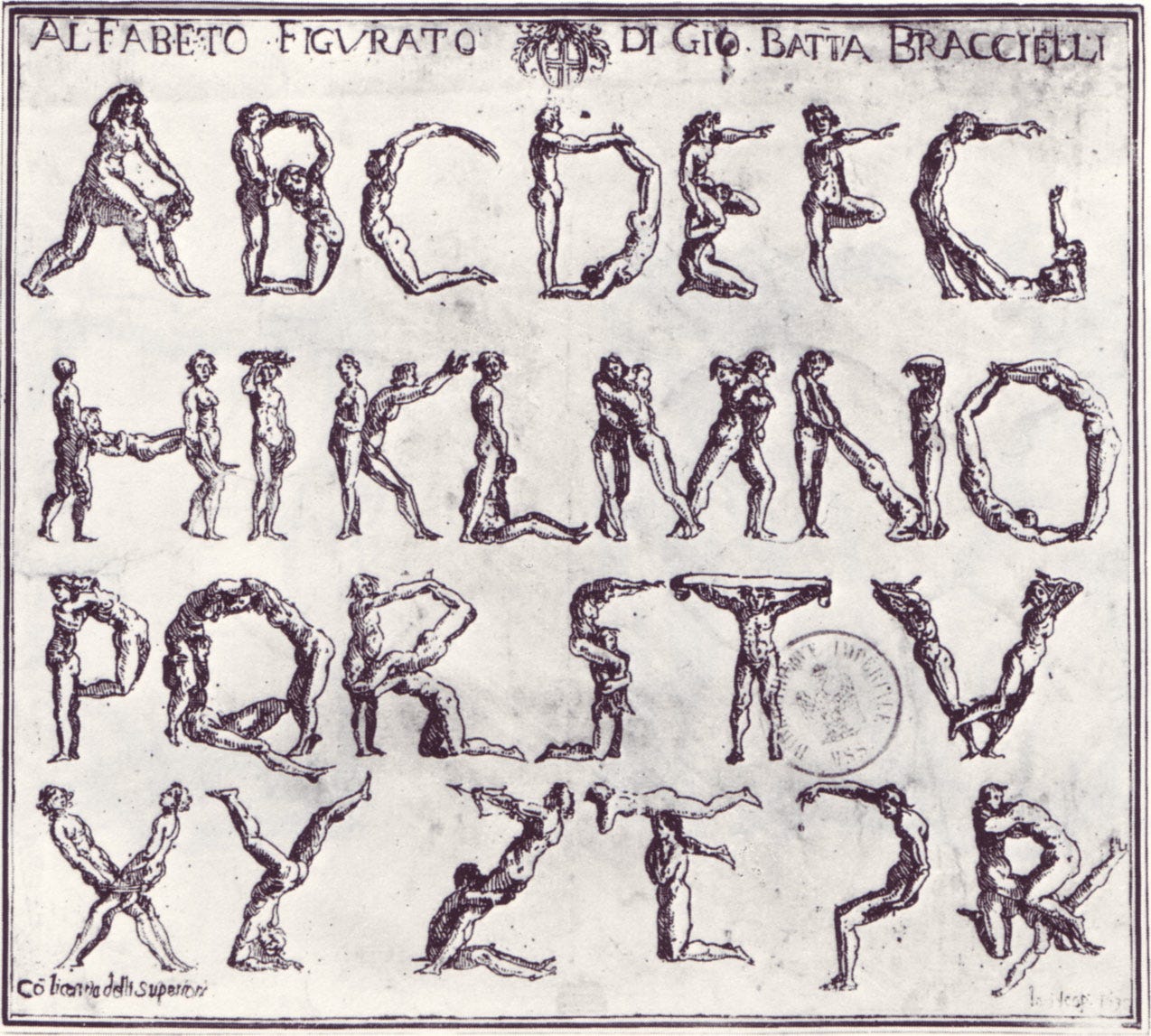
One day, on the Number 22 Bus from Islington (apartment) to Covent Garden (the studio), on the seat next to me someone had left a single page of paper with a photocopy of an etching on it. It looked a lot like—in fact it looked exactly, like this:

I looked up the following blurb in Wikipedia for inclusion here: “The Bizzarie di varie figure (Oddities of various figures), issued in Livorno in 1624, are the liveliest and most original etchings of Braccelli (active 1616–49).1 The Bizzarie exhibit characteristics of the artistic style called Mannerism, which originated in Italy in the sixteenth century. The term derives from the Italian word maniera, meaning style. It is applied to a way of working that was developed by Raphael and others.”
Knowing exactly nothing about this background, only wondered if little creatures could fly around and create a legible font, was this a skill that human beings could do?
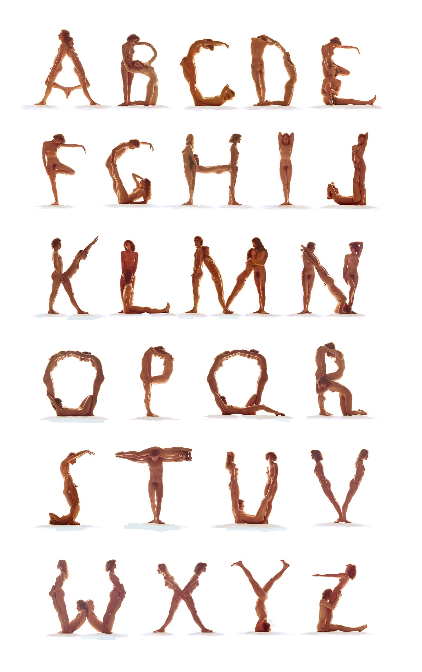
We were between catalogs, the studio was empty. Not only that, but right next door to us was The Covent Garden Dance Center. I knew several of the dancers, and showed them the etching. “Can you guys do this?” I asked. “We could try.” said some. “Of course we can!” said others. “Naked?” I asked. 1975 was close enough to the swinging sixties which had flowered in London, so: “Sure!” they said.
My brilliant young assistant, Chris Thomson, set up an remarkable lighting scheme which showed light coming from within the scene rather than from outside, and the cast rehearsed for a day or so. In three days we had it. The camera used was the Pentax 6×7 medium format. The film was developed by none other than Graham Nash, who had a London camera business to go along with his growing rock and roll career. The film looked great. The size of the negatives assured that enlargements could be huge. We were on our way, somewhere. But where?
No one got paid. It was just a high-spirited valentine for the eye, but when I realized it might be the first photographic freestanding alphabet ever (it was), I thought it might a smash-hit coffee table book. We started calling it Love Letters. First we showed it in slide show form in galleries: the Arnolfini Gallery in Bristol; and at the Photographer’s Gallery in London. After this brief run, nothing.
As for the book, the publishers in New York were afraid some of the images might offend someone (the Z). In Japan, pubes were never allowed to be published, ever. The project foundered, forgotten by everyone, except me. Time went by.
I had moved to Alabama in 1978, determined to be a freelance again, and brought Love Letters to a gallery, fearing I might be tarred and feathered by an angry mob of puritans. But no one complained about the nudity at all! Teachers even brought their third grade students to see it.

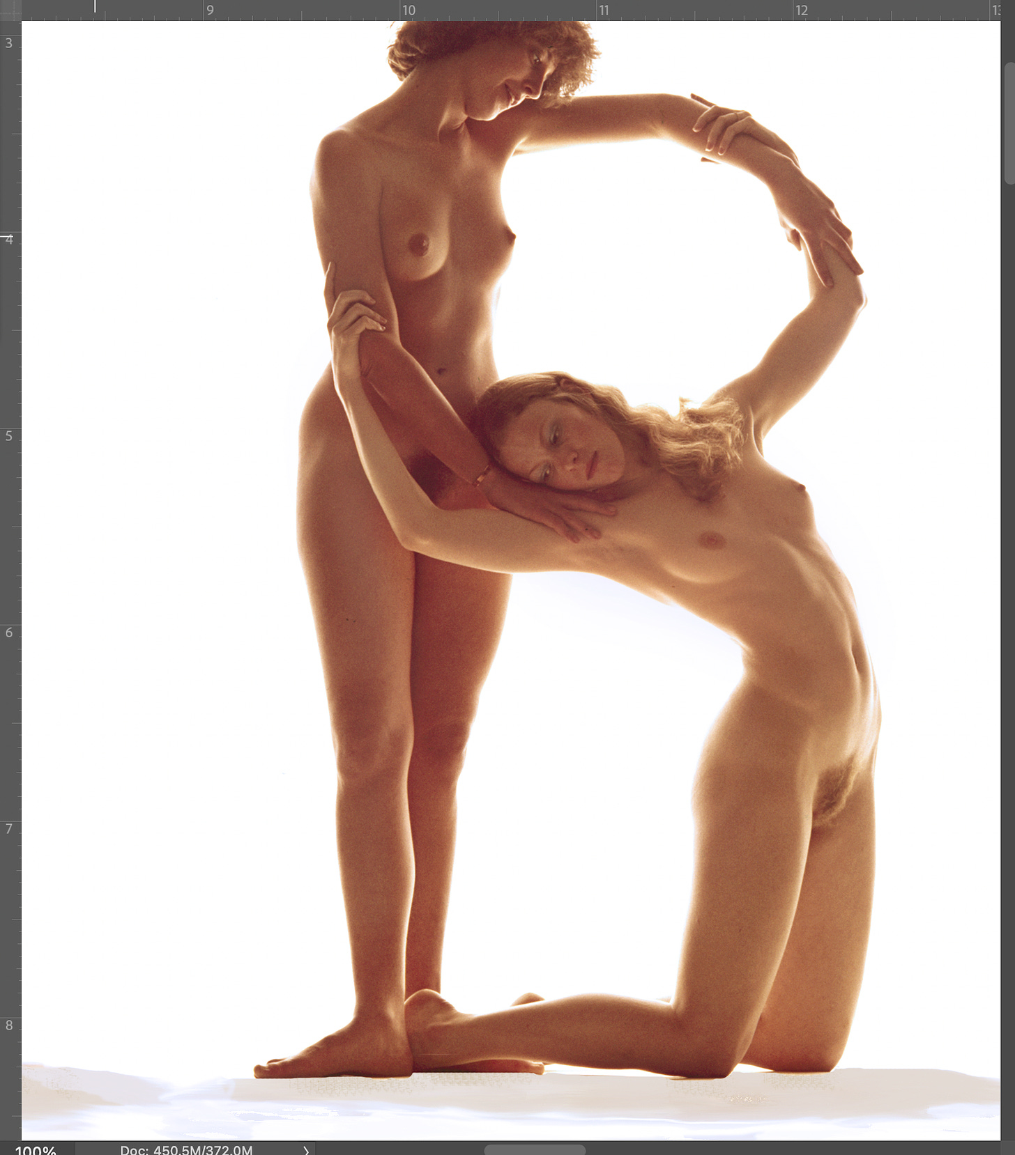
What changed after all these years was the invention and inclusion of digital imagery into the computer world. Color film was and is remarkably expensive to print, but with computers it was a cinch to simply scan, and cut and paste. So it was easy to use as a working typeface. Some (sadly) forgotten computer wizards contacted me to make it a typeable font. Alas that wasn’t the way to go. We made it into Tomi Vollauschek’s 3D Type Book, which was an honor. An ad agency in Norway saw Love Letters there and offered me lots of Euros to use it to plug a TV movie. As I said, the chromes are of excellent quality, and 100% blow ups look like this:

Finally, in 2008, I decided to do a little valentine size book of my own and Blurb made a few. It is still available from them. They make wonderful little (7×7) Christmas gifts.
When we first shot Love Letters nearly fifty years ago, there was an inkling about making a film with them. Our earliest shows were done with dupe 35mm slides and two projectors to fade the transitions. Below is the best I can do with photoshop, and Graphic Converter, but I haven’t learned AI yet, and I’d be willing to bet it could be lots better.
Happy holidays to you all. And all the best in 2025.
A Photographer’s Newsletter is a reader-supported publication. To receive new posts and support my work, consider becoming a free or paid subscriber.

 Rowland Scherman (PC/W Staff photographer 1961-64) was like any other PCV as he traveled the world, photographing PCVs at work. I met him in 1962 in Ethiopia. He would go onto become a nationally known photographer, famous for many of his photographs. This gallery of photographs by Rowland includes images of iconic figures from the 1960s, from musicians Janis Joplin and Bob Dylan, to public figures Bobby Kennedy and Martin Luther King. He has now created a website. Here is one of his first publications with a few of Rowland’s famous photographs.. John Coyne (Ethiopia 1962-64)
Very creative and stimulating – if only marginally related to the Peace Corps. It would have been a smash-hit coffee table book with the right publisher. I noticed some quirks in the 17th-Century version: the letter “J” was missing, and I couldn’t decipher the final three drawings after “Z.”
Substack has all my submissions. This version of love letters misses the movie, which shows the actual dance sequence
The website is https://www.rowlandscherman.com/
I wish the website had a search botton. I was hoping to see early photographs of Ethiopia. However, I enjoyed the article and the process of turning the 17th Century design into contemporary photographs.